FE ONLINE
FE CREDIT (FEC), a consumer finance company, hired me to lead the product design of a new mobile application. This application will merge and replace two existing mobile apps; an app that allows customers to apply for a loan, credit card and digitally sign contracts, and another app which allows customers to manage their loans and credit cards.
ROLE
UX Research
Product Design
UX Writing
Prototyping
Usability Testing
PLATFORM
iOS & Android mobile app
TIME
February-June 2021
(5 months - Phase I)
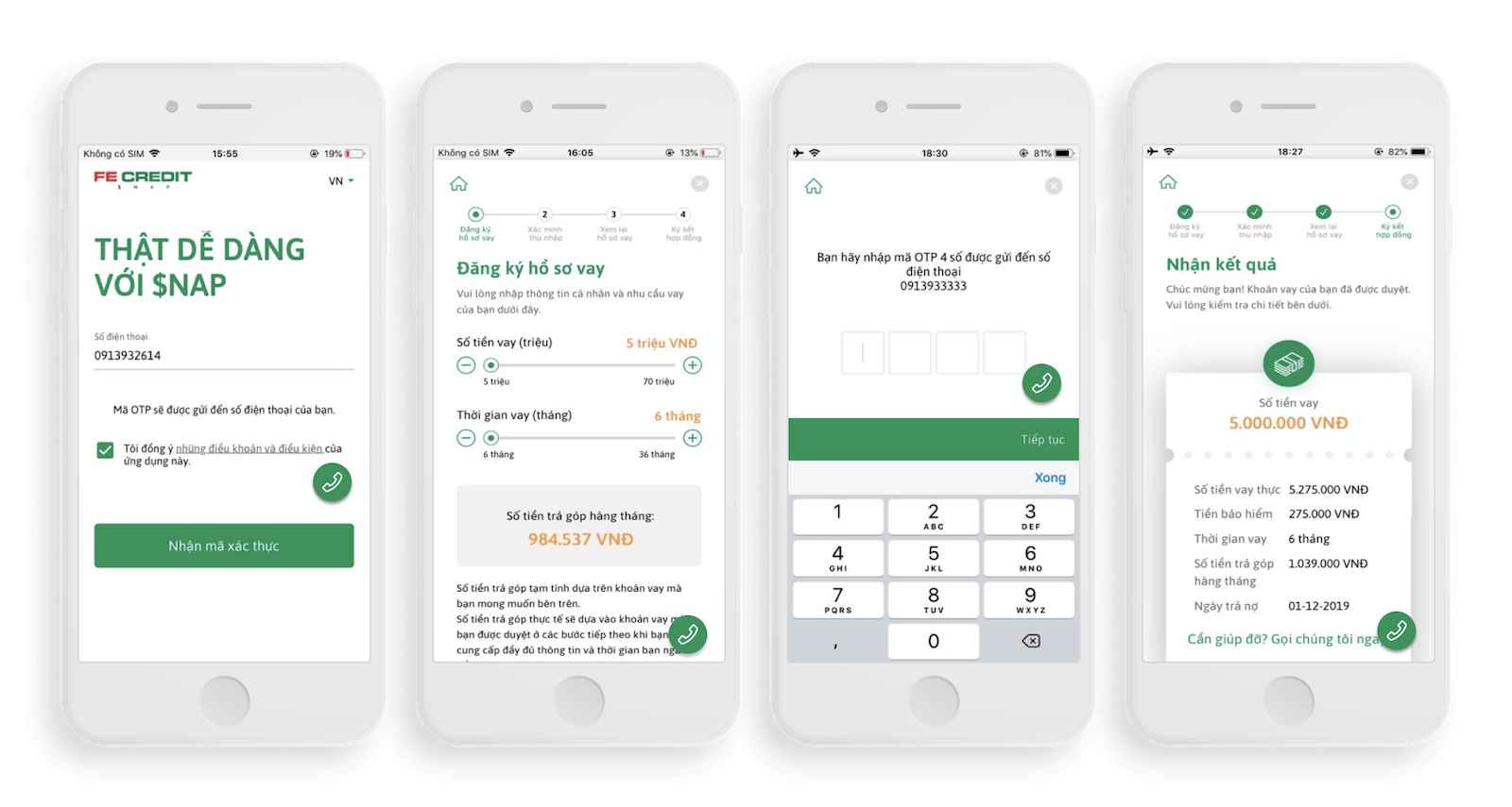
Existing App Design
$NAP
Loan application
Sign contract
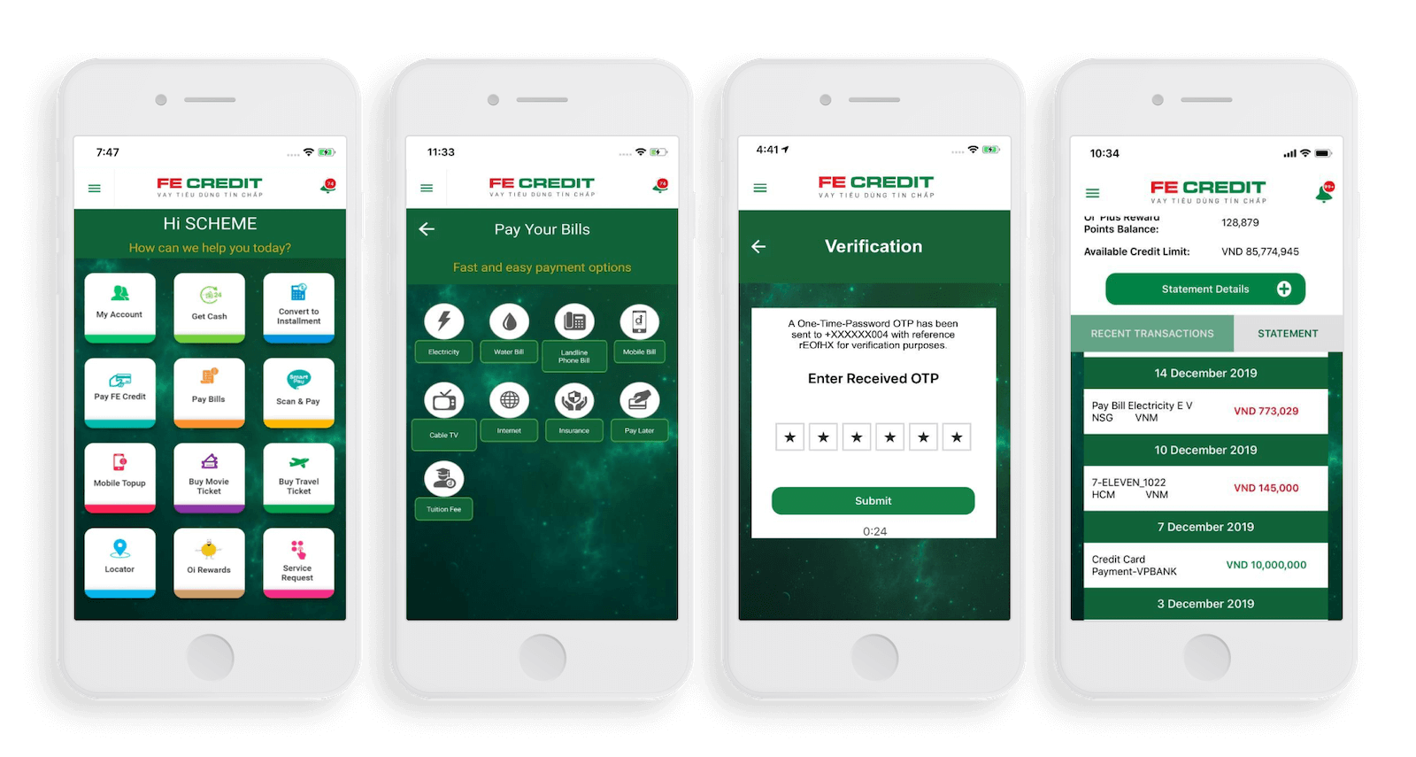
FE CREDIT Mobile Application
Loan management
Credit Card management
Background
FEC revolutionized the Vietnamese consumer finance market by creating the first digital loan application and contract signing process, which significantly reduced the need for in-person meetings with agents. However, a separate tool was created for customers to manage their loans and credit cards, resulting in a fragmented customer experience. Two separate visual styles and mobile applications were required, a white-label mobile app and a white-label mobile web app, which resulted in suboptimal digital user experience.
Initially, the creative team consisted solely of myself for the first 3 months. It wasn't until later that another designer joined (a visual designer who I trained to become a UX/UI designer). All high-fidelity UI designs were outsourced to a front-end vendor. Which I worked closely with to ensure the UI patterns were appropriate for the brand. Additionally, I collaborated with two product owners (PO) to create the best possible user journey within the given time frame.
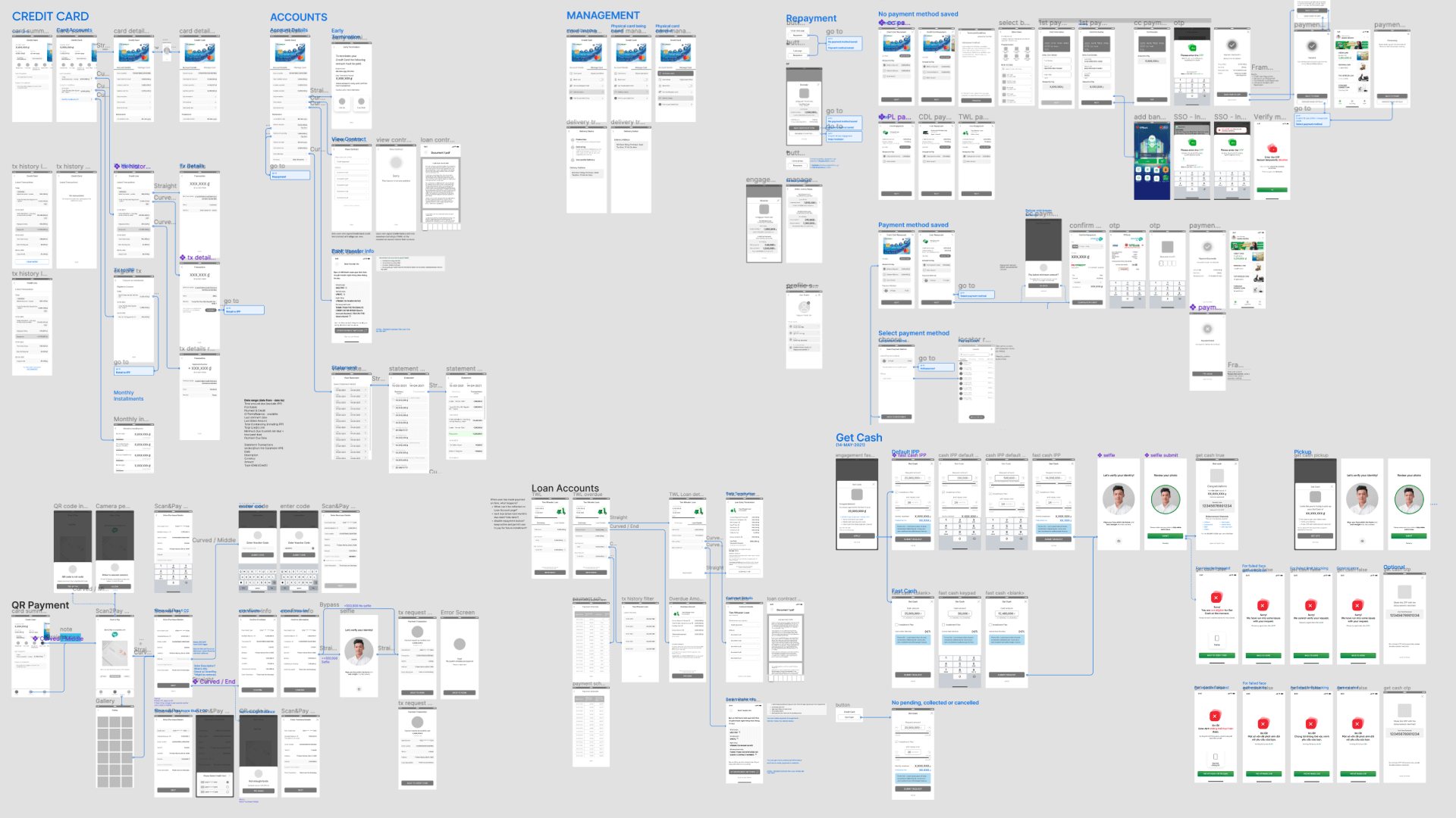
This project was divided into two phases. This case study focuses on the first phase, which involved implementing most of the features from two existing mobile applications (excluding the loan application, which was part of phase 2) and resolving recurring pain points. In the first phase, a total of 65 functions were designed.
Team Goal
- To launch MVP by Q3, and reduce existing friction from the existing app
- Increase eSign conversion.
Implement features that would reduce calls to Customer Support (CS). - To increase security and reduce risk of delinquent borrowers.
My Goals
- Conduct user research to identify customer and in-house CS pain points.
- Identify must-have and nice-to-have features, and work with the Product Owner (PO) and Business Unit (BU) accordingly.
- Design the app's UX architecture to support future expansion.
Discovery
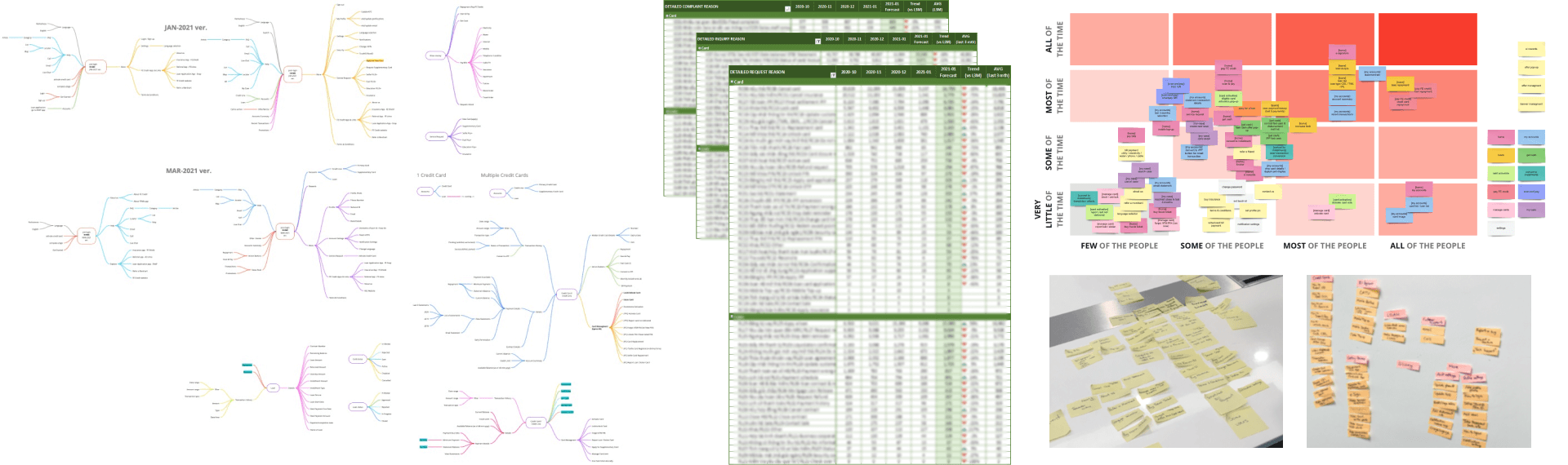
By collecting data of active customers (over 80k) provided by Business Intelligence team, I created 2 personas that covered approximately 85%+ of our customer base. And with customer feedback data collected by the CS team (call centre data of 460k+ inquiries, 220k+ requests, 9k+ complaints), lead the the PO team with mapping prioritization matrices (effort vs. impact), MoSCow and affinity diagram, and red routes to determine the direction of the new app.
Additional features we added to phase one of the project were the result of our findings during the discovery phase. We discovered that many customers required consistent reminders to complete some particular action. Something which drop-off management and operations team previously managed. Implementation of in-app reminders, would significantly reduce in-house operation's workload.
Ideation
As always, designs have started with scribbles on a whiteboard or paper, which are then converted to low-fidelity designs.
Validation & Iteration
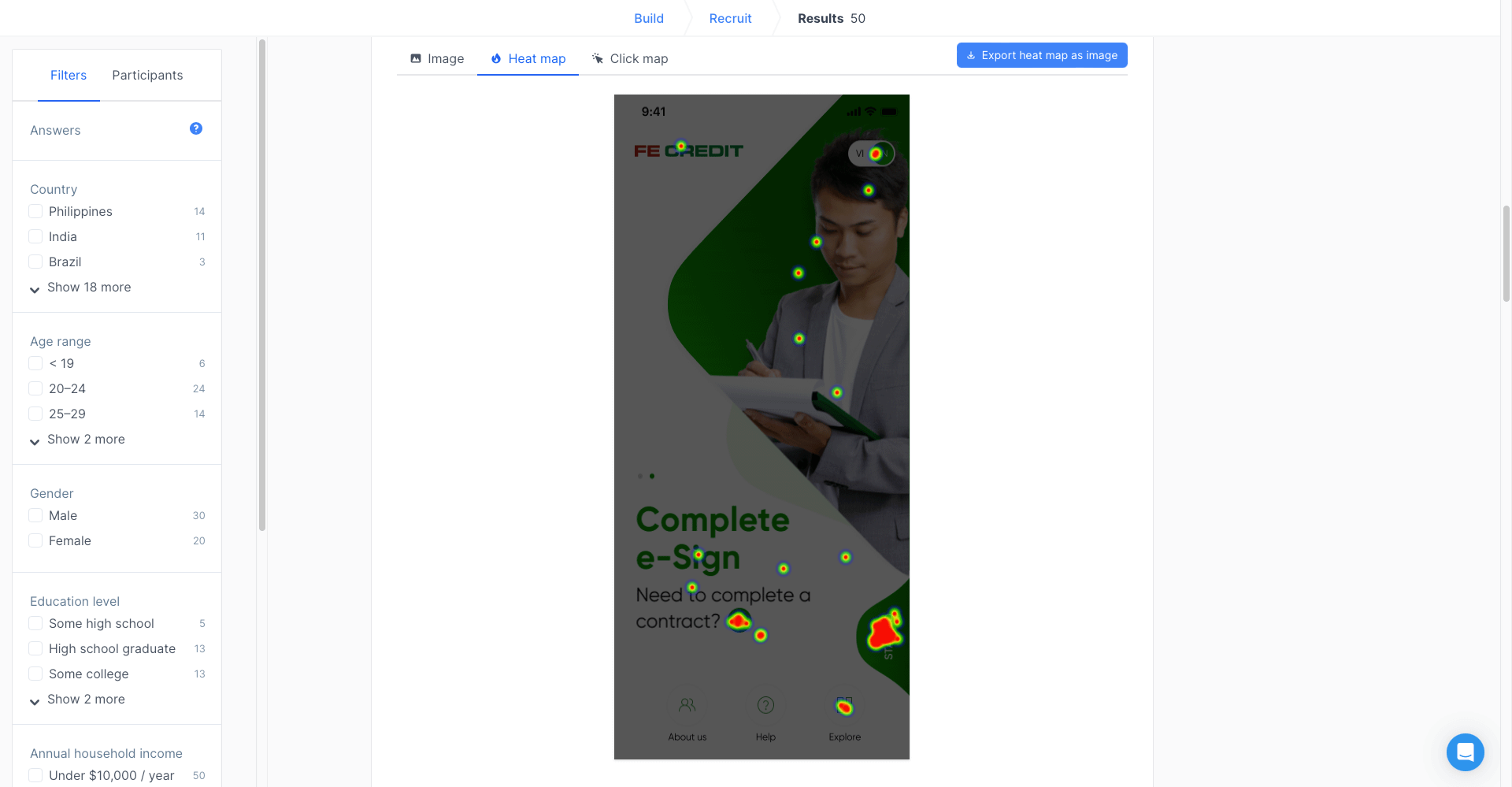
For select user flows and high-fidelity wireframes, we utilized UsabilityHub to validate our designs and work with the outsource vendor to make appropriate changes.
Enhancements
Some of the new features that we implemented to better the user journey.
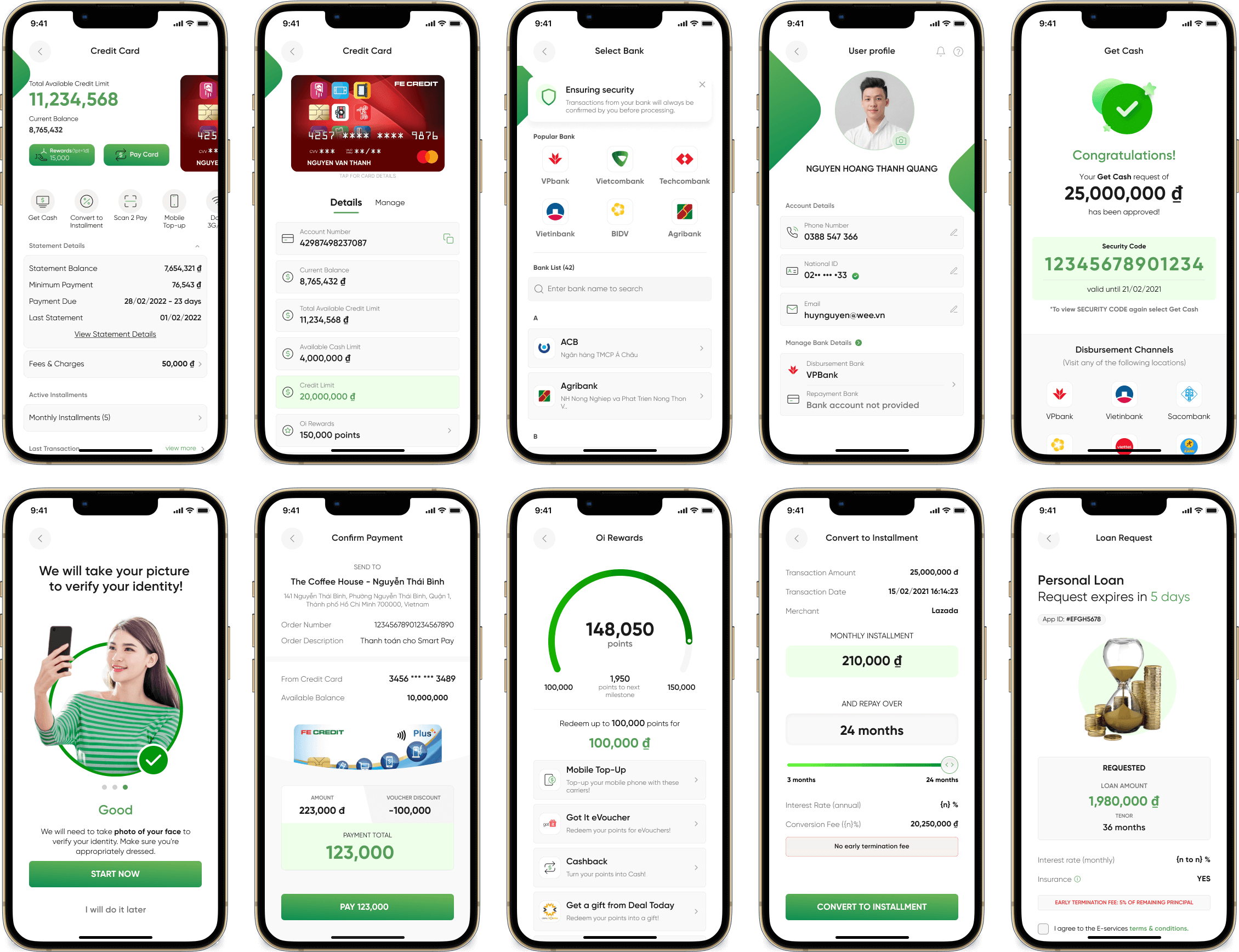
Pre-login eSign
As one of our MVP goals was to reduce Turn Around Time (TAT) and reduce friction for when customers are to sign their approved loan application, this feature was designed and implemented.
Customers who have worked with an in-person sales staff and completed full KYC (face verification, uploading national ID card, input personal information, and wait for KYC approval) and have a pending contract can easily digitally sign their contract without registering for an account.
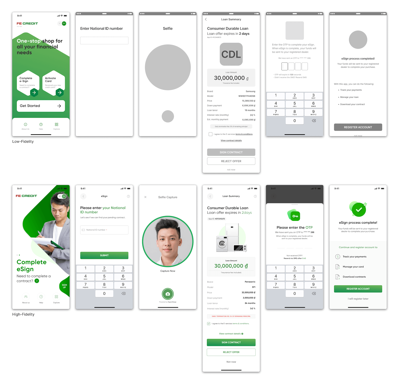
High-fidelity wireframes designed by outsourced vendor
Pending Action
On the post-login home screen, if the customer has any pending action to perform, there will now be a floating call-to action card fixed to the bottom of the screen which will always be present until such pending action is completed or expires.
- Review application offer and eSign contract
- Late loan/credit card repayment reminder
- Activate physical credit card which customer signed and received by courier
- Reminder to pickup the cash loan, the customer requested
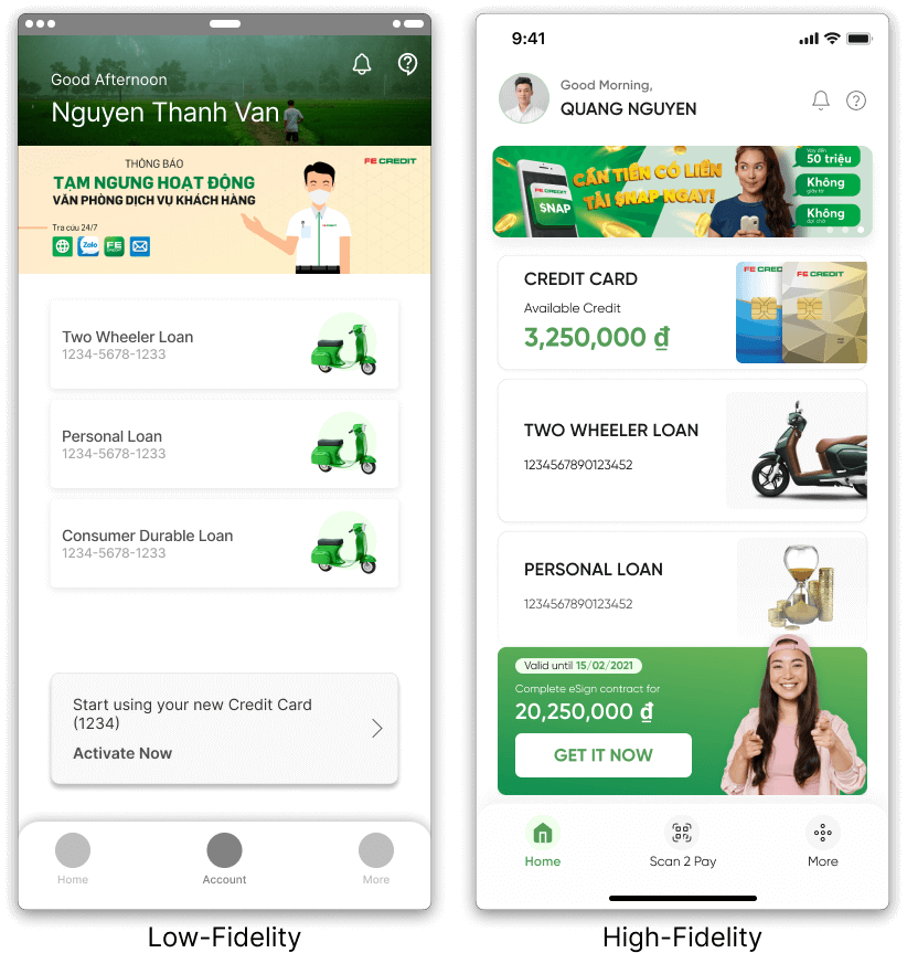
High-fidelity wireframes designed by outsourced vendor
Promise to Pay
When a customer fails to make their repayment as per the agreed time, a collections agent would begin to call the customer directly. And at times, a customer might receive a call from collections, multiple times a day.
To resolve one the major complaints made to CS, we designed and implemented a promise to pay feature, where once the repayment is overdue. When the customer launches the app, before arriving to the post-login home screen, they are given a reminder, and the ability to make an online payment, or present a reason for the late repayment. By selecting “Make repayment later” a mute flag would be assigned to the customers account for the rest of the day and tomorrow. And no collections agent would be calling the customer until such time.
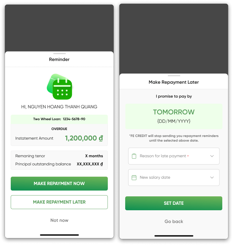
High-fidelity wireframes designed by outsourced vendor
💡 Learning Moment
To ensure that the user can complete a task as frictionless as possible has always been my goal. But, when working on a consumer finance app, when dealing with lending company funds to a user, and profits are only made when users makes a payment with interest, there are many issues of risk and security. Risk and legal team constantly keep adding more hurdles at users to identify if they are indeed qualified to borrow.
Alas, we must also consider bad actors. Ensure that scammers and identity thieves cannot easily gain access to user's accounts or be approved for a loan, yet create a user friendly product.
And also prevent fradulant staff members who have access to customer data, and sales agents from taking advantage of customers and their identity at the same time. Why are there so many bad apples out there. Working on this balance between user needs and business needs was very educational.
Final Product
High-fidelity wireframes designed by outsourced vendor
Retrospective
After app launch, product design team members visited a 7 partner shops to collect feedback from field sales agents and customers regarding the new app. All provided positive feedback with regards to the redesign. Negative feedbacks were limited to the speed of KYC approval, speed of issuance of OTP via SMS and duration of loan application underwriter review.
Scammers
The mobile app originally supported English and Vietnamese, but soon after launch, English language display was removed due to scammers.
Scammers would switch the app to English and present to low-tech non-English reading users that, without the scammers assistance, customers would not be able to successfully complete KYC and apply for a loan or credit card.
Localization & Skilled UX writer
As a non-Vietnamese speaker, I was unable to support directly with the localization. With no Vietnamese UX writer on the team, some content were translated directly from the English content (which I provided). And due to multiple members assisting with the localization, the voice of the app was not consistent.
Some customers mentioned that they could identity how certain screens were written by an Hanoian, a Saigonese or someone from Central Vietnam. I’ve learned that having a strong translator/UX writer or a voice and tone guideline in the targeted language might’ve helped with the situation.
Personal Takeaways
01 As the main user advocate, educating the PO team and stakeholder on UX design principles and other methodologies by preparing presentation material and hosting workshops required a lot of effort, and fortunately made the team work closer together and become a defender of the user.
02 Having a strong PO team leader that fought to remove or add particular functions to enhance the user experience and increase the bottom line, and not to simply meet another stakeholder’s KPI was greatly appreciated.
03 With so many functions to design in the allotted time frame, balancing between good enough and great design and selecting which designs to validate and which designs should be fine was personally challenging. Letting go of a design after the allotted sprint, and moving onto the next was difficult, but ultimately led to delivering all designs on time.
04 Working with a very quick and strong UI design team with motion design and illustration skills was amazing, and gave me the time to concentrate on UX research and the UX design of the project.
Selected Works
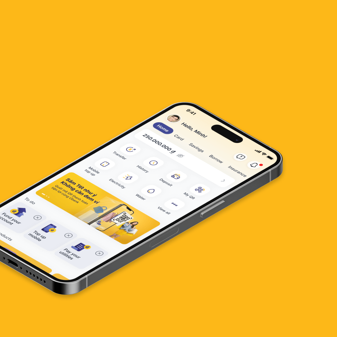
Übank 2.0Neobank mobile app.
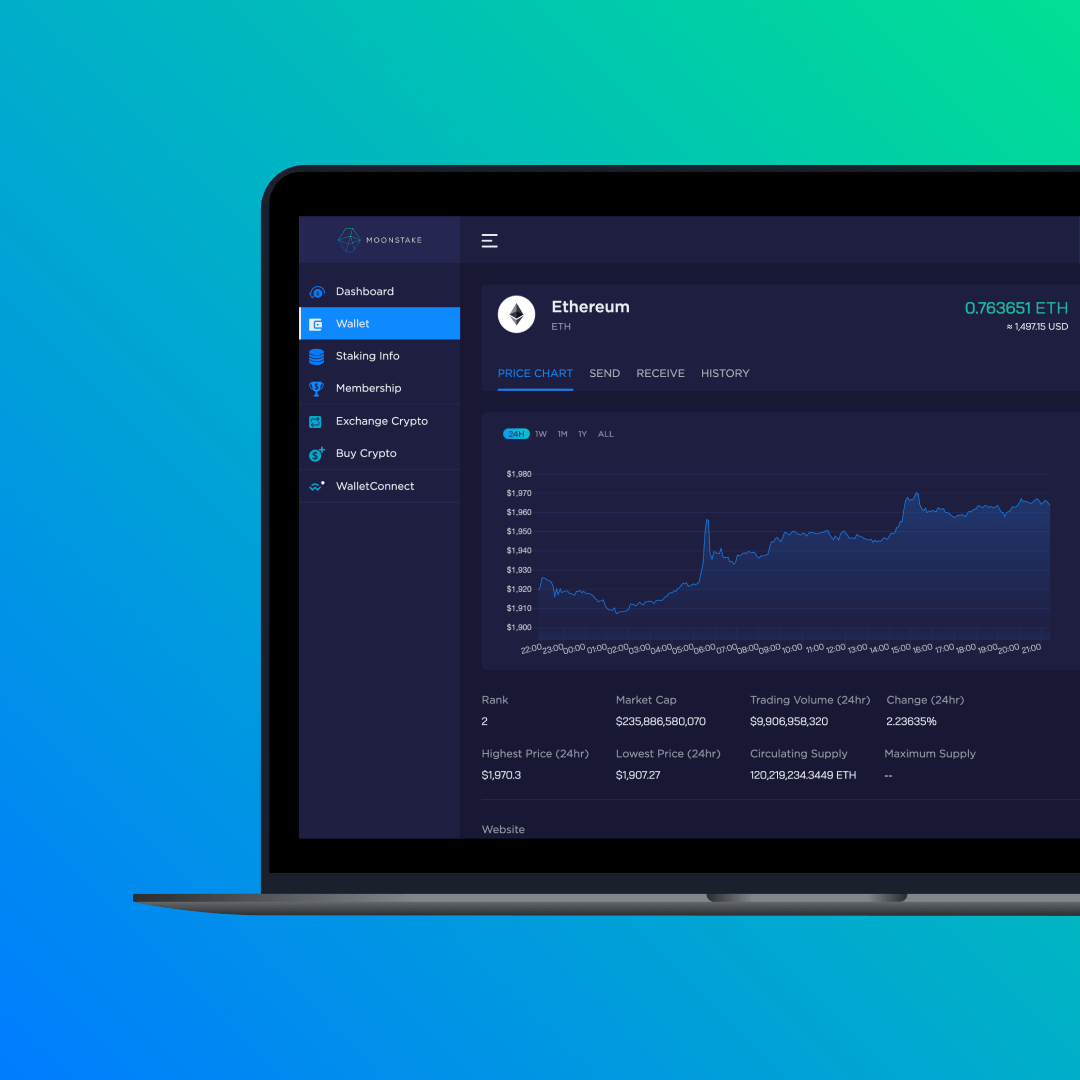
MoonstakeStaking pool and network marketing platform for web and mobile app.
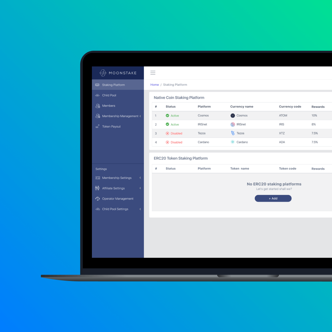
Moonstake: Operator ToolBackend admin portal for staking and network marketing platform.
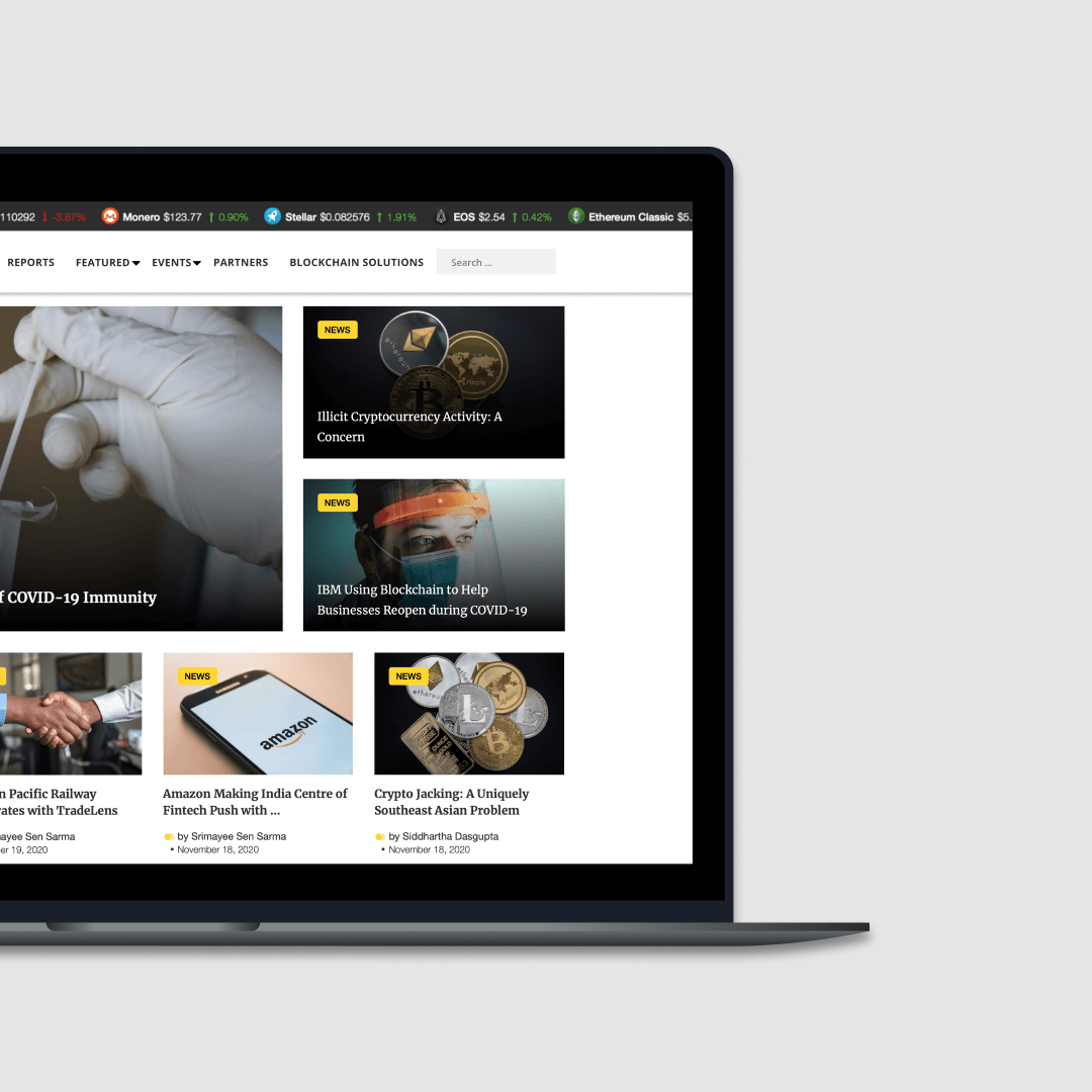
Asia Blockchain ReviewNews website focused on Asian blockchain market.
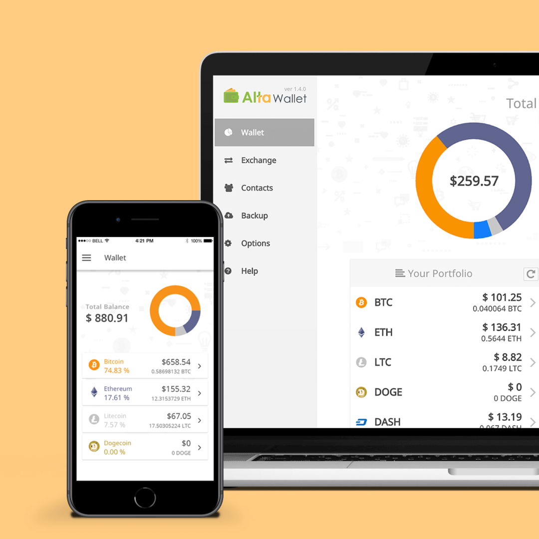
Alta WalletCryptocurrency wallet for mobile and desktop.
Contact
Copyright © 2025 Paul Watabe
hello@paulwatabe.com