Übank 2.0
At the request of my employer, I led the redesign of an existing direct banking mobile app. The business decided to move back-end development in-house and discontinue licensing the current platform from a third-party vendor. This required replacing all UI assets and working with a new front-end team. Additionally, our team continued to support design requests for another app, FE Online. Note that this project was frozen after 2.5. months.
ROLE
Head of Mobile Application User Experience Department
UX Research
UX Strategy
Design System
Prototyping
PLATFORM
iOS & Android mobile app
TIME
March-May 2023 (2.5 months)
Background
The relaunch of this redesigned app was meant to be completed within 6 months, starting in April 2023. Our team consisted of three UX/UI designers, one intern, and myself. The same team members also worked on FE Online and CRs for the current Übank app until it was sunsetted.
We spent one month before the start of the project on user research and product design strategy. During the remaining time, we prepared a new design system. Just before the official start of the project, our team was informed that front-end development would also be developed in-house. Consequently, we quickly decided to start preparing design token documentation to assist our new in-house front-end team while designing stories according to the scheduled sprints.
Unfortunately, after two sprints, the project was halted due to internal restructuring, and I was laid off. The following is an incomplete project.
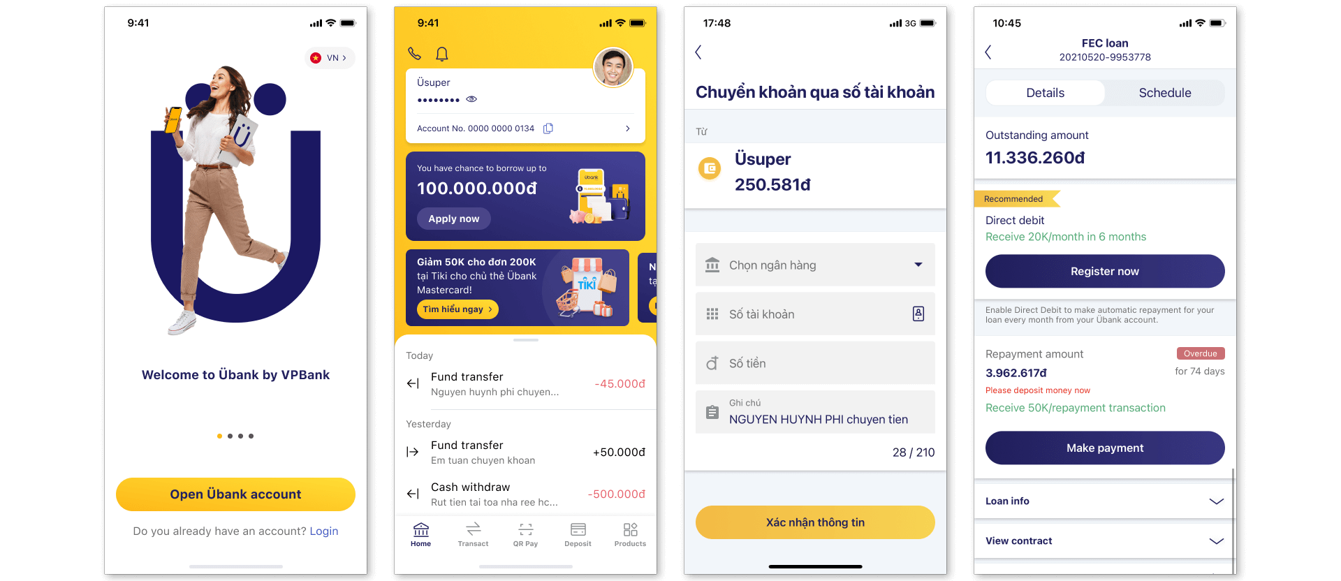
Existing App Design
Discovery
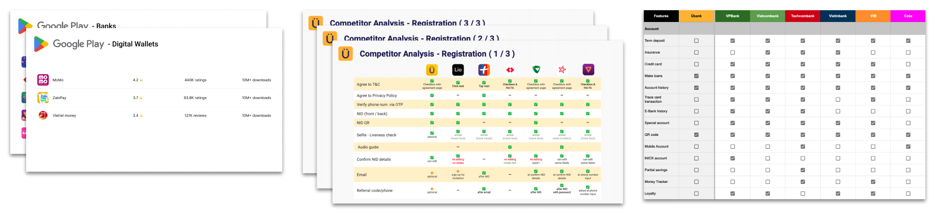
I led the team to perform research before any design began with a competitive analysis of banking apps from both traditional banks and direct/neo banks in domestic and select international markets.
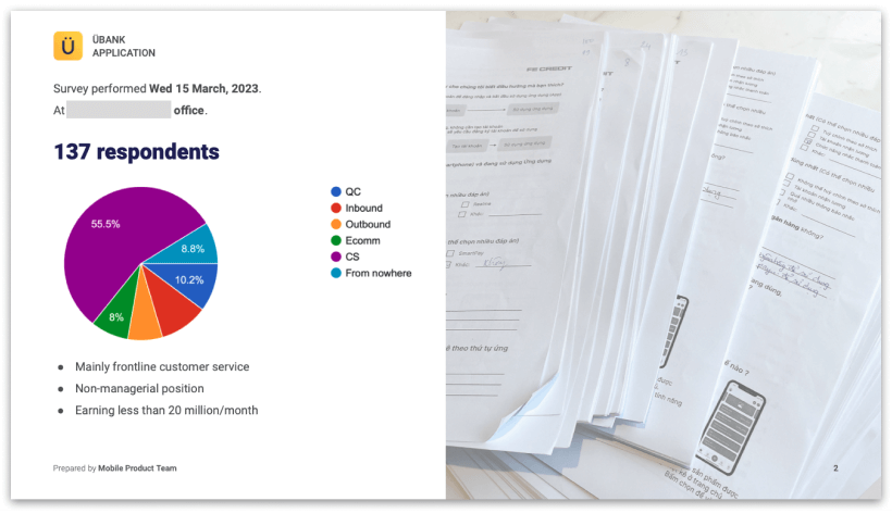
To also collect feedback from users of their financial app habits, I initiated a visit to our in-house call centre team to conduct a survey. We received 137 completed surveys.
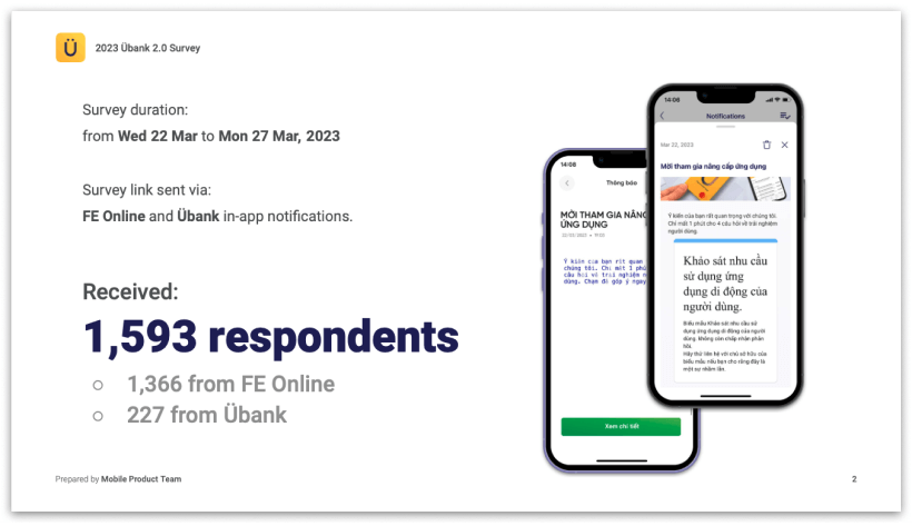
As management was not convinced of the direction to be taken by the survey results, we improved the survey and converted it to a digital form and distributed a link via FE Online and existing Übank’s in-app notification system. We collected a total of 1,593 responses over a 5-day period.
From both surveys, and from past user interviews, we identified which features are important to customers, pain points and more for both CASA (current account saving account) banking apps and eWallets.
💡 Learning Moment #1
There are many best practices for good UX, and a common one being, “avoid clutter”, “don’t put everything in a single screen”, “adding too much and not removing enough”. This best practice is certainly suitable for many markets. Amazingly for our many low-tech and lower income earning users, the busyness of the home screen, where frequently utilized specific actions are just a click or scroll away (not hidden behind a category icon) to considered to be more comforting than having to recall where the function they require is hidden behind which category representing icon.
💡 Learning Moment #2
Many western direct (neo) banking apps have similar designs, where the current balance is presented in large font and/or the most recent transaction is shown on the home screen. After conducting user interview and surveys, we discovered that our customer segment would prefer that such information not be as prominent, as they find it more difficult to open the app in public when performing QR payments, which are very common South East Asia (SEA).
Ideation
Guest Account
To differentiate ourselves from other traditional banking app and eWallets, and to showcase to users what they can experience, we planned to implement a “guest” account. Where users could discover features which our app would provide, and also investigate the interest rates we offer for automatic interest paying savings accounts, term deposits and loans.
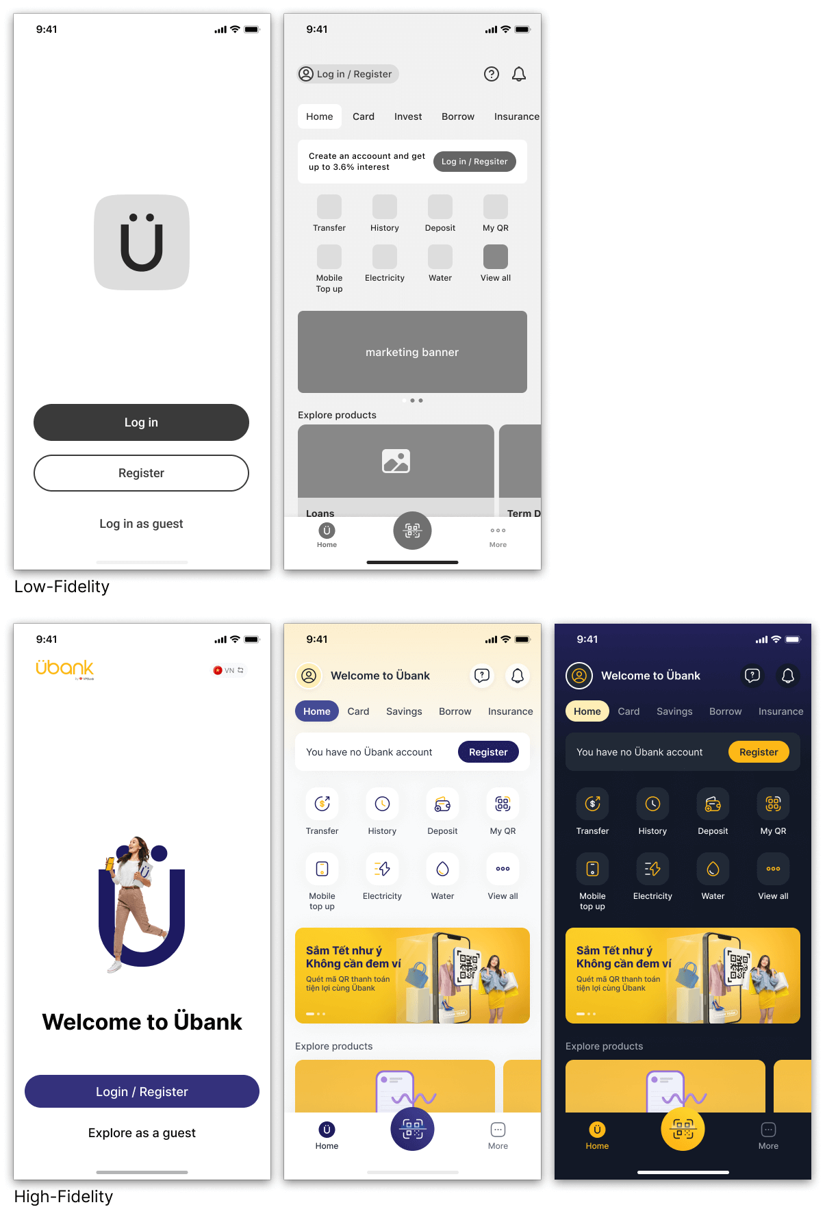
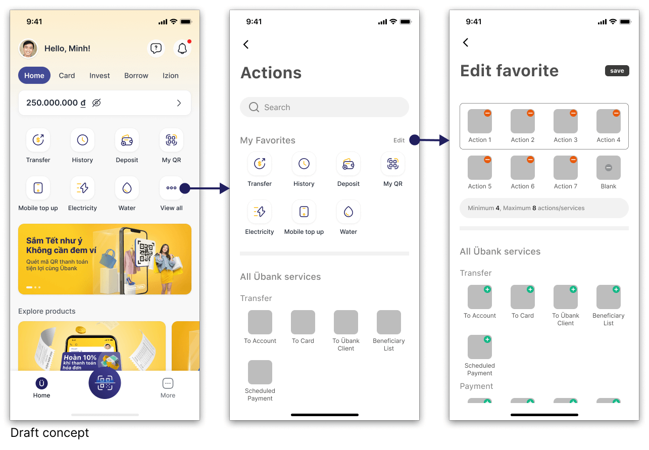
Service Hub
Though not scheduled to be delivered until a later sprint, as we found that there were many customer segments with different needs, we decided to move forward with a design, which permitted users to customize all of the service/action buttons on the home screen.
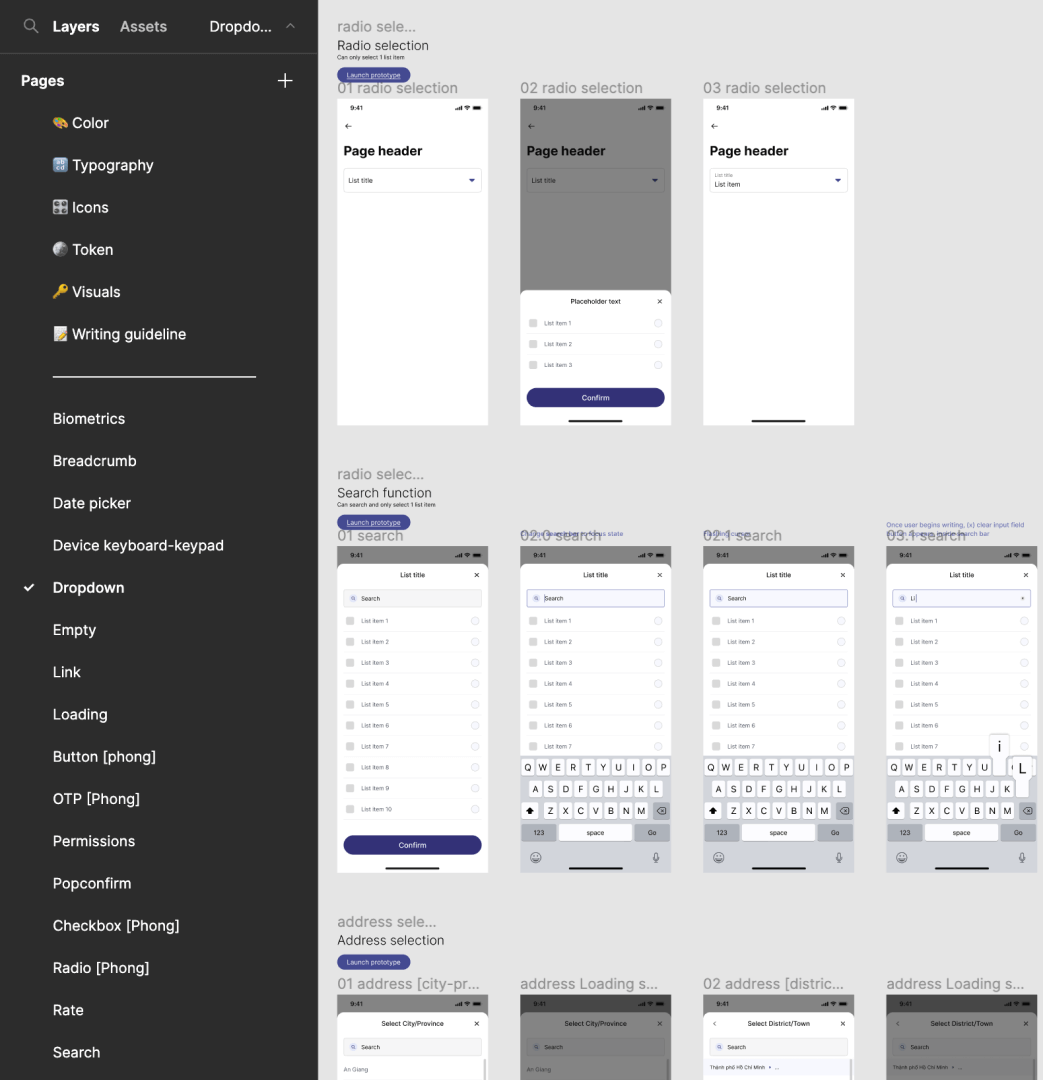
Design System and beyond...
Initially, a vendor was to be utilized for the front-end development which we would work together with their UI team to establish a new design system. Near the end of sprint 2, a decision was made to form a new in-house front-end team and all front-end development was to be managed in-house. To ensure that development could be delivered quickly and smoothly as possible, I directed the product design team to learn Figma’s new variant feature, and educated the team on how to prepare design tokens and workable prototypes of all UI components.
After 6 days working on this new design system the app redesign project was shut down.
Selected Works
FE OnlineMobile app to apply and manage consumer loans.
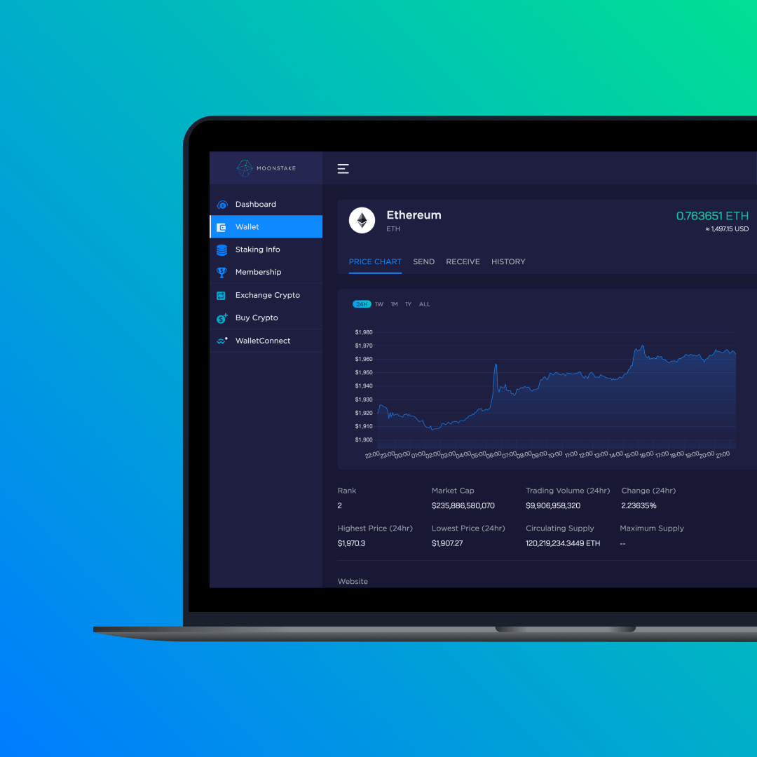
MoonstakeStaking pool and network marketing platform for web and mobile app.
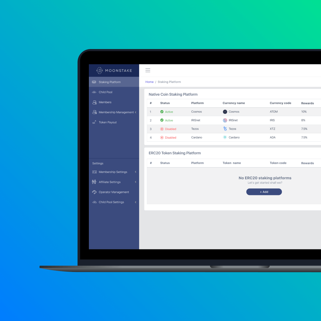
Moonstake: Operator ToolBackend admin portal for staking and network marketing platform.
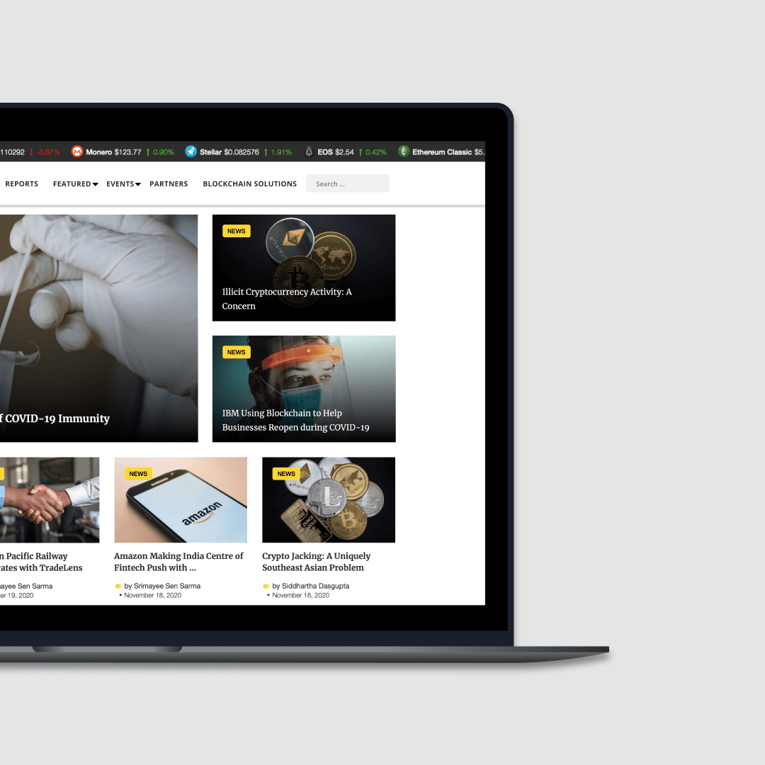
Asia Blockchain ReviewNews website focused on Asian blockchain market.
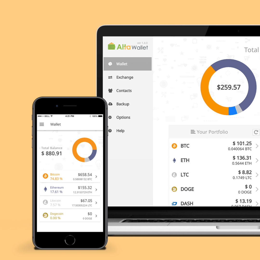
Alta WalletCryptocurrency wallet for mobile and desktop.
Contact
Copyright © 2025 Paul Watabe
hello@paulwatabe.com